Over the course of a weekend, research and design solutions to reduce anxiety in the BART experience.
Buying a Bart ticket and getting on the right train can be stressful and confusing. We wanted to explore ways to make the experience more seamless. 60,000 people ride Bart during peak hours. Finally, designing solutions for riders with different abilities, ages, etc. seemed like a unique challenge.
1 of 2 UX Designers working on research, usability testing and building/testing a prototype.
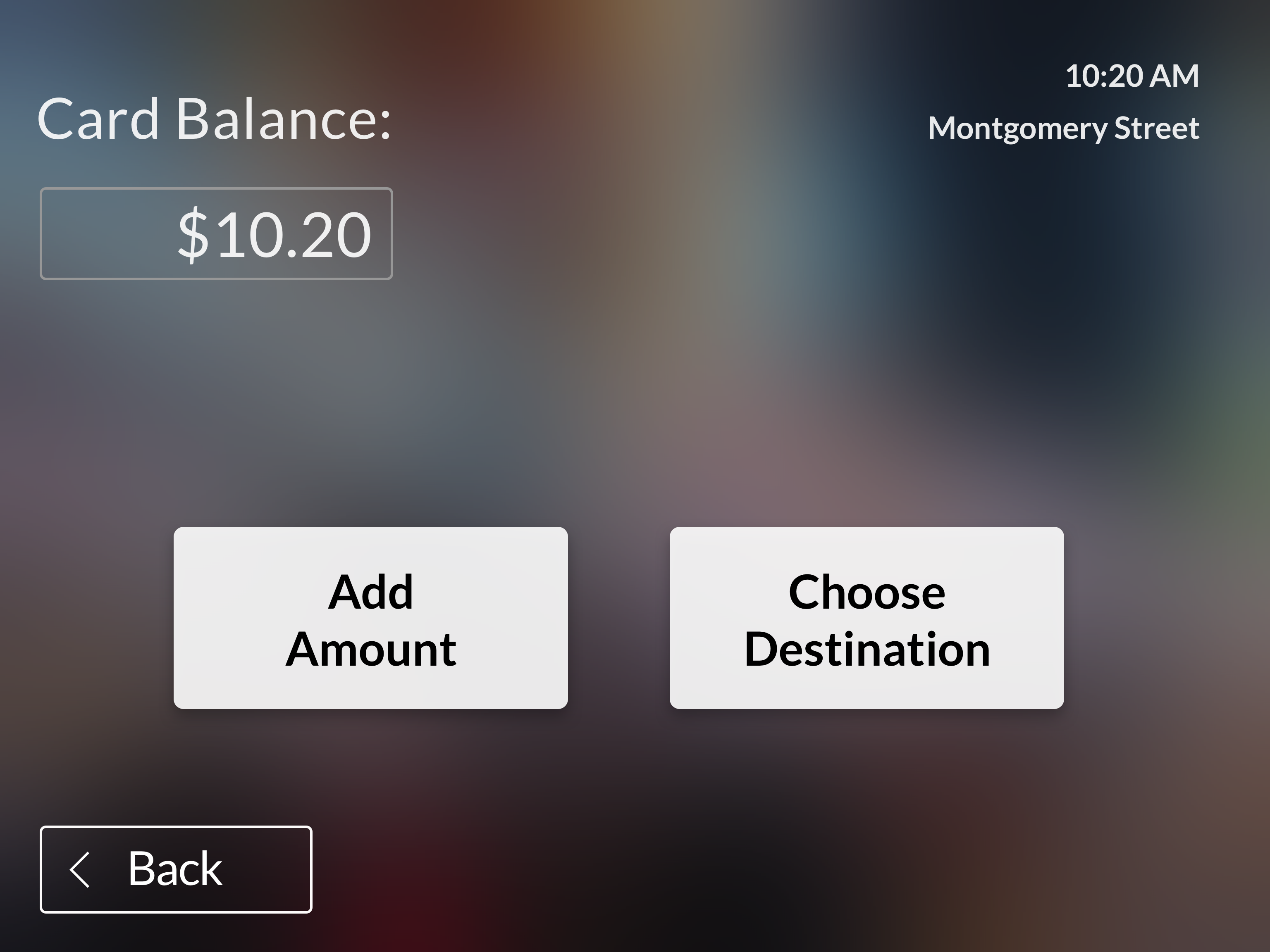
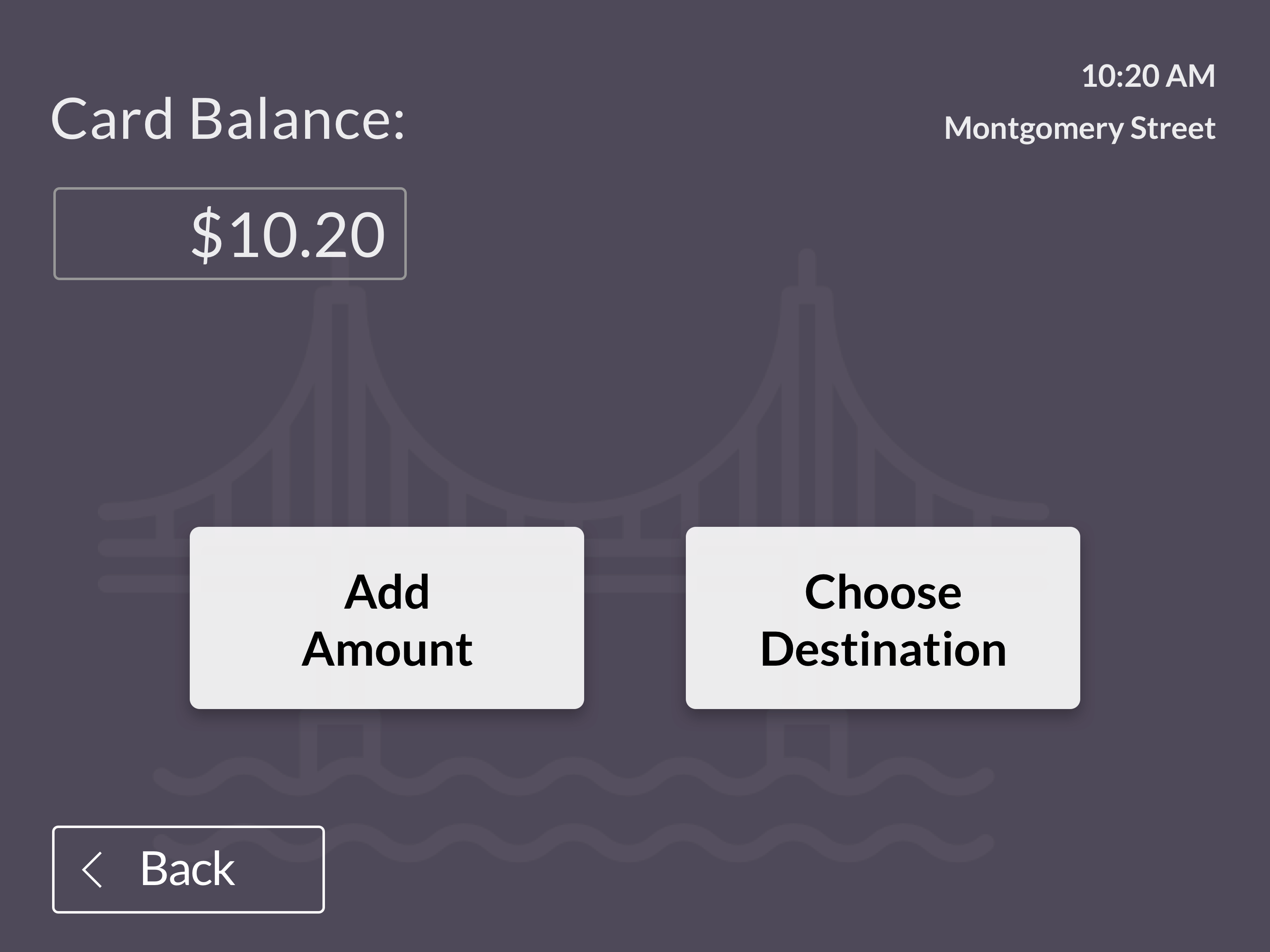
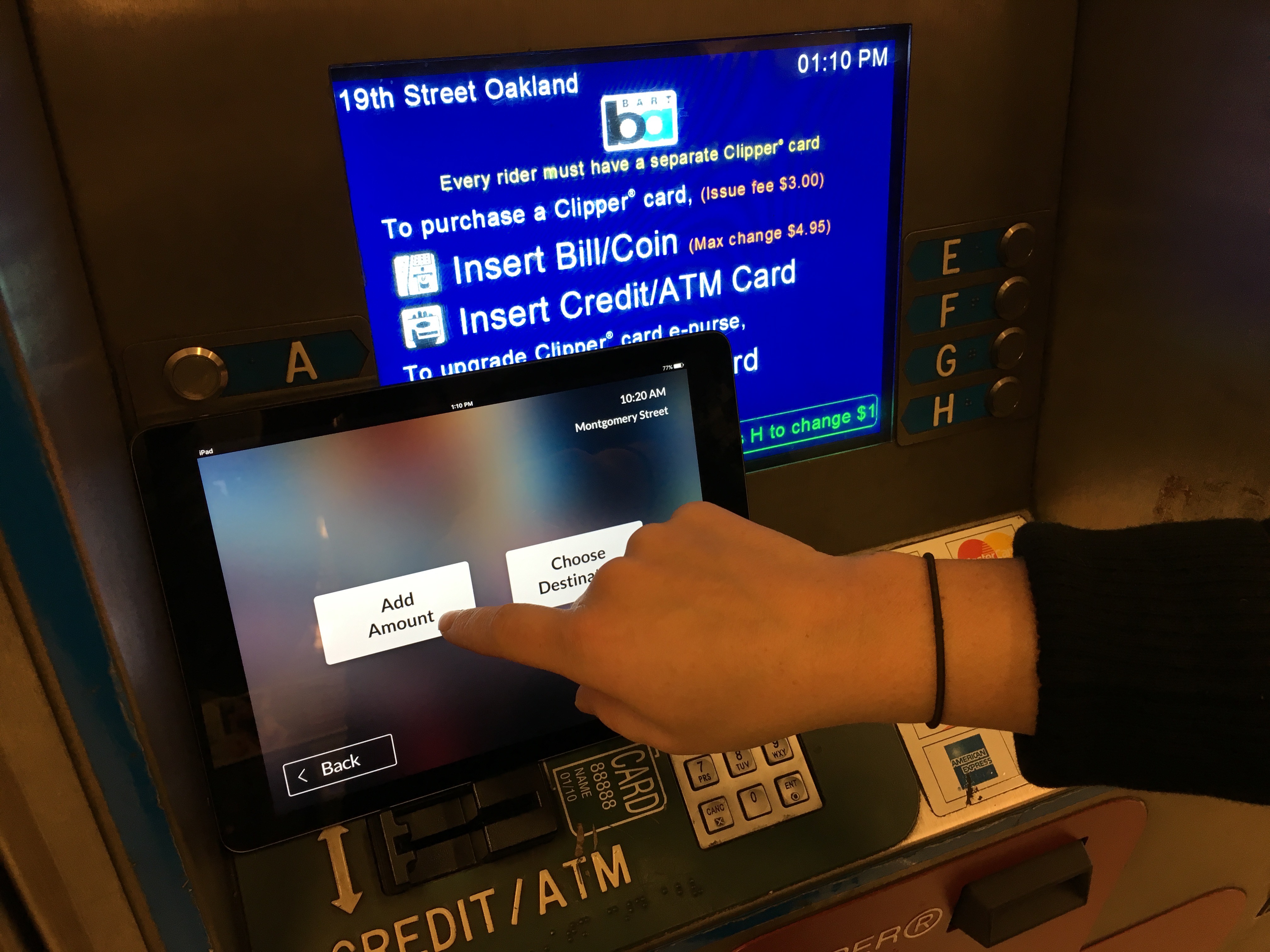
We built a tablet version that replicates the screen size and experience of the Bart ticketing machine. We based this on the infrequent/new rider assuming this will be the most difficult rider to help.

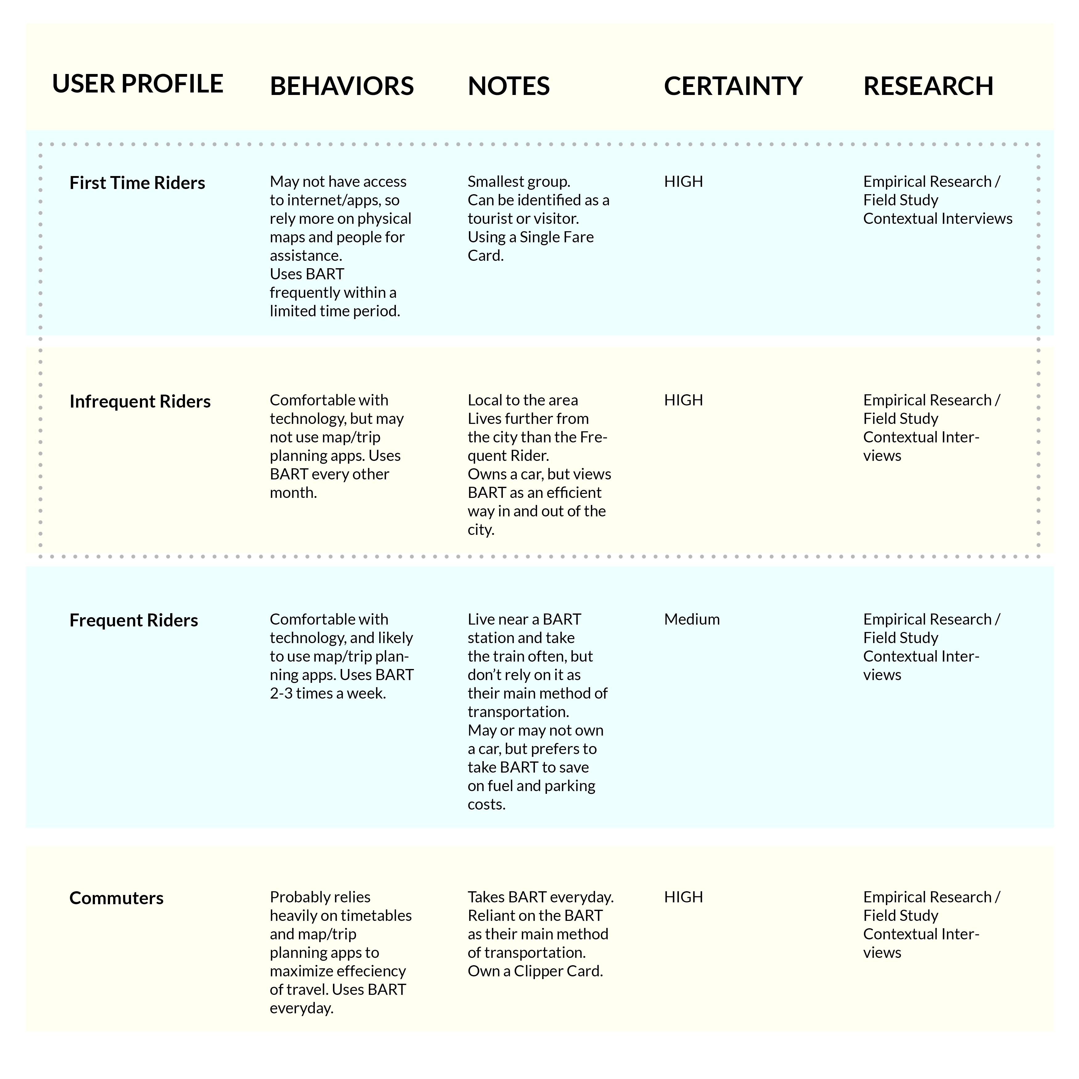
To better understand our riders, we created a learning plan to evaluate what we knew about our different types of riders. We identified four types of users and what their core needs and motivations are. Due to the likelihood that a commuter and frequent rider using a Clipper card, we focused on the First Time Rider and the Infrequent Rider as they likely interface with the ticketing platform more than the Commuters and Frequent Riders that use Clipper Cards that auto-load.
StoryBoards helped us to get into the mentality of when our users feel anxious about taking the Bart train. Focusing on the experience of the first time and infrequent rider was important as they are most likely to interact with the ticketing machine. Many Bay Area residents use a Clipper Card which auto reloads and go through other pain points and experiences.
.JPG)
To find our target rider, we went to areas where we thought we would find new or infrequent riders. Therefore we focused on Montgomery Street and the Coliseum Oakland Airport stop. We interviewed 20 people total. Nearly all of the riders were our target (tourists or infrequent riders).
To get an understanding of public transit norms, we watched videos (thanks youtube!) of 5 international metro systems including Madrid, Paris, New York, Tokyo, and Santiago. We took down notes to compare positives and negatives of each platform.
Through looking at the other systems, it became clear that the Bart functions a bit more like a commuter rail than a traditional metro. This is mainly to the fact that there are multiple fares dependent on distance. We also learned that the Bart break from certain norms of public transit such as adding in a language option and a clear start button.
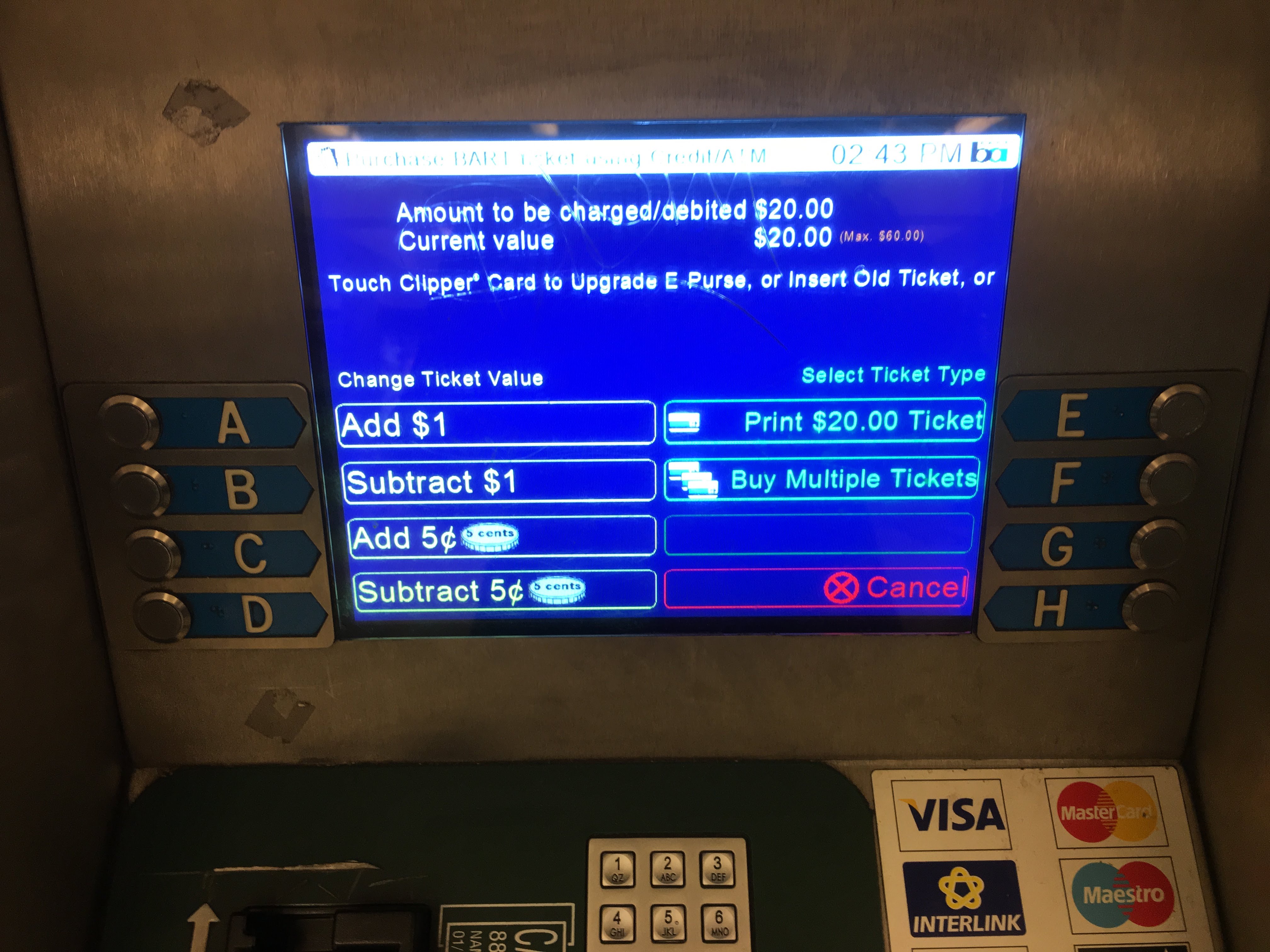
The Bart is functions more like a commuter rail than a metro. Also, Bart is actively encouraging regular riders to use Clipper cards Local Bay Area infrequent riders often have more complaints and questions for Bart employees than new riders or tourists. Finally, the international standard is to include a language option, which the Bart does not have.
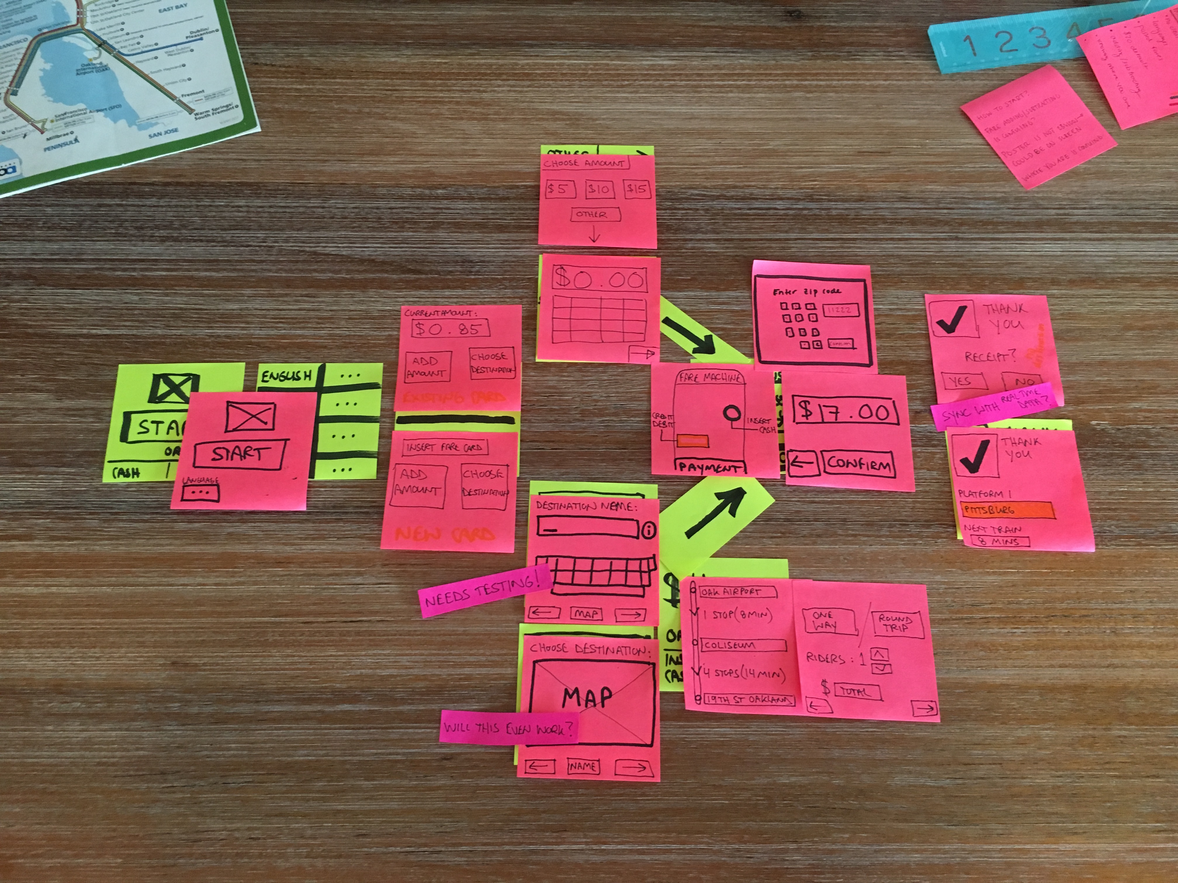
As one does, we built out a potential task flow that created a more seamless process with less steps than the current Bart ticket fare machine. With the task flow in mind, the prototype was created addressing some of the accessibility and usability issues.
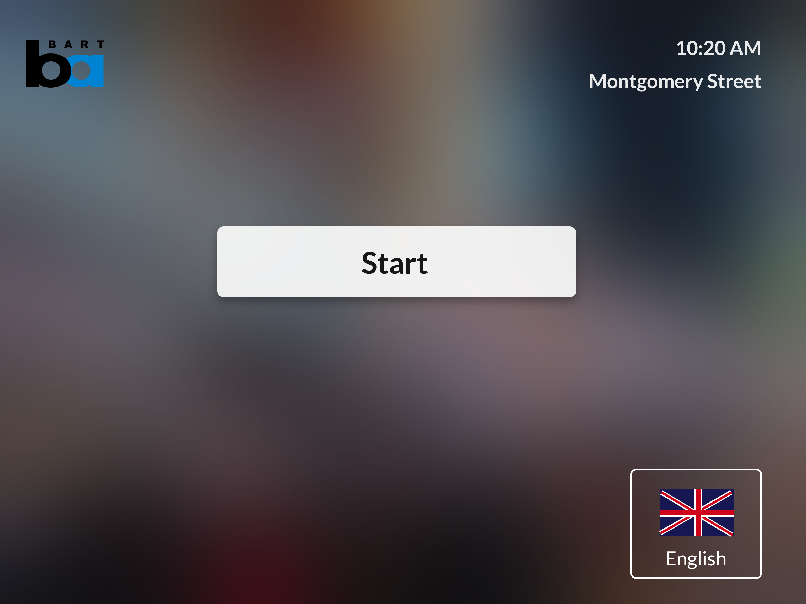
The current start screen is overwhelming and asks too much of the user, especially if they are new to the Bart system. Having a start button helps people orient themselves.
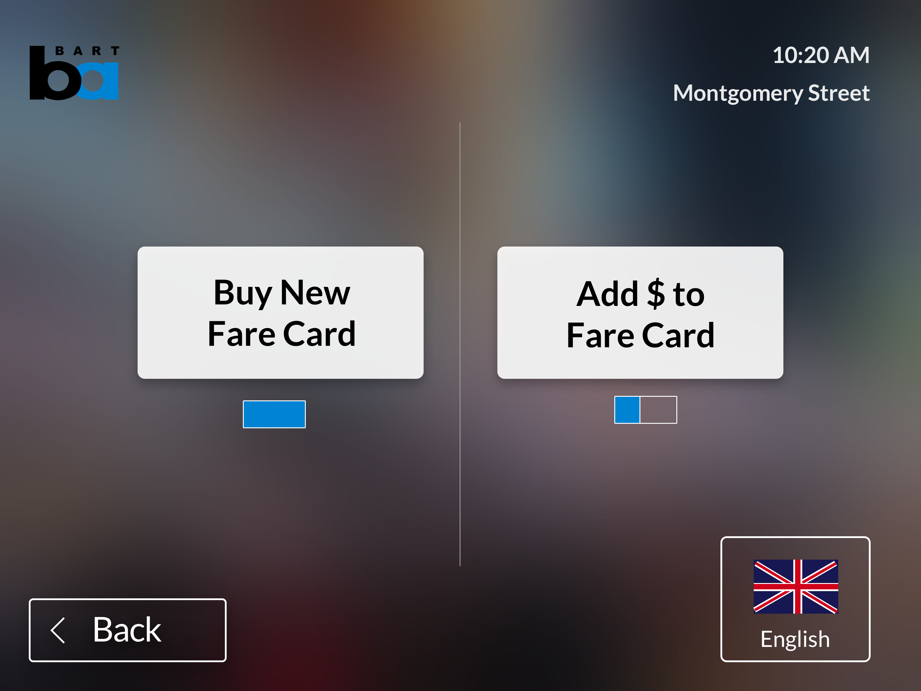
Buying a new ticket and adding money to a ticket are different tasks. People doing each action have separate needs, so we created different flows for each task. This was inspired by other metro systems.
.png)
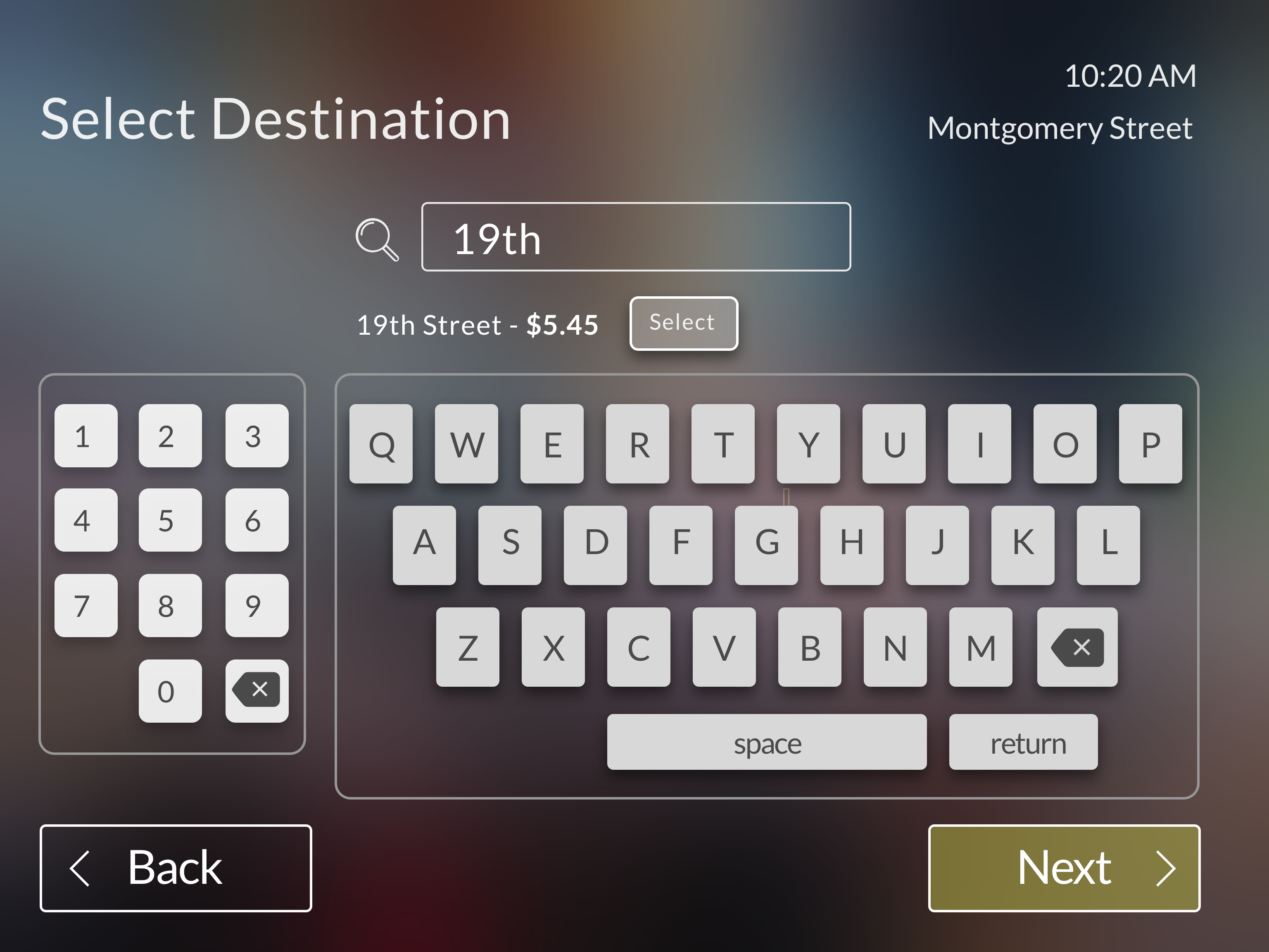
Since Bart rides are dependent on how far you travel, we wanted to design a flow enables people to buy the value of a ticket based on where they are going. Users can type in the name of the end station they are going to.
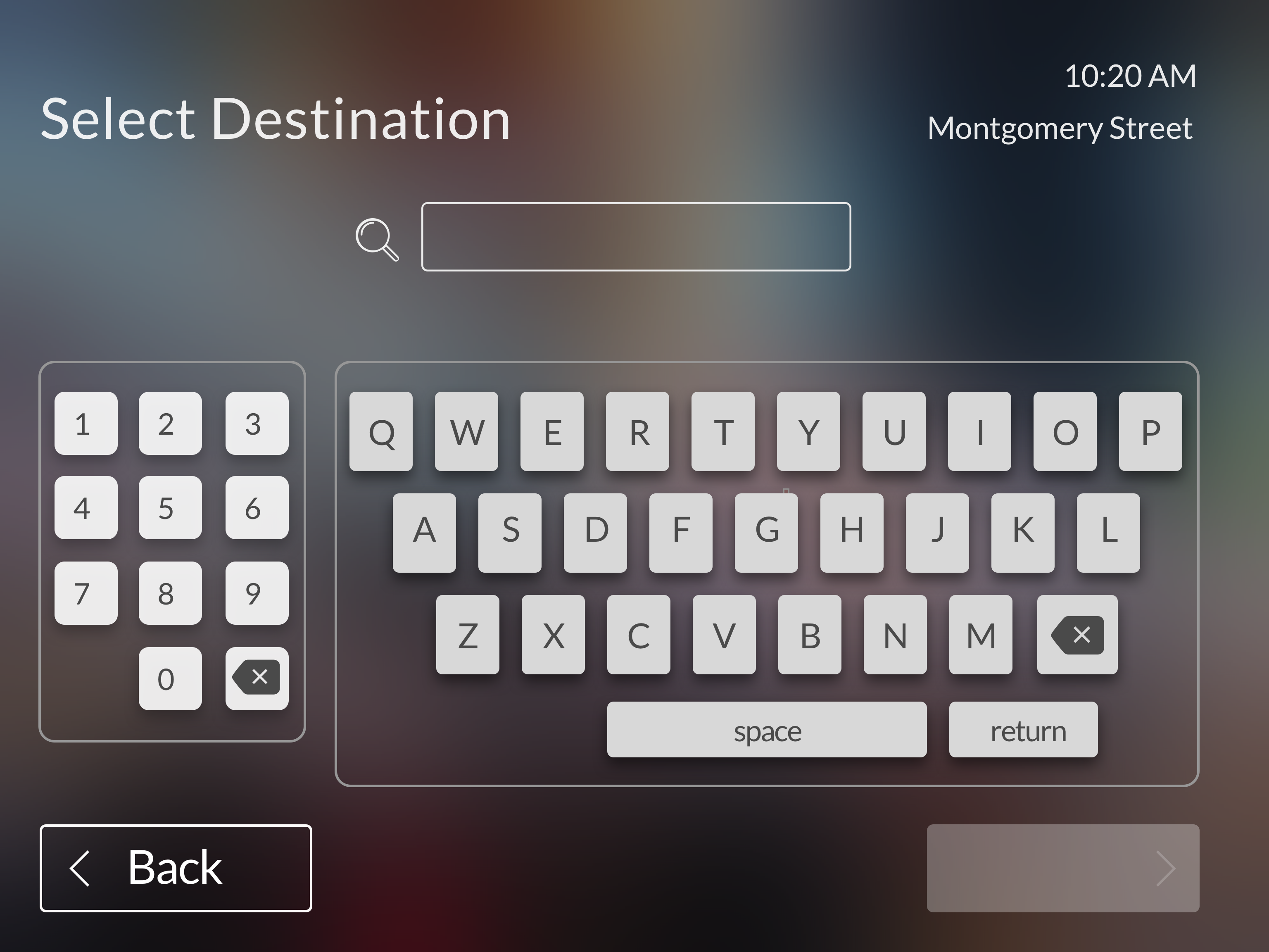
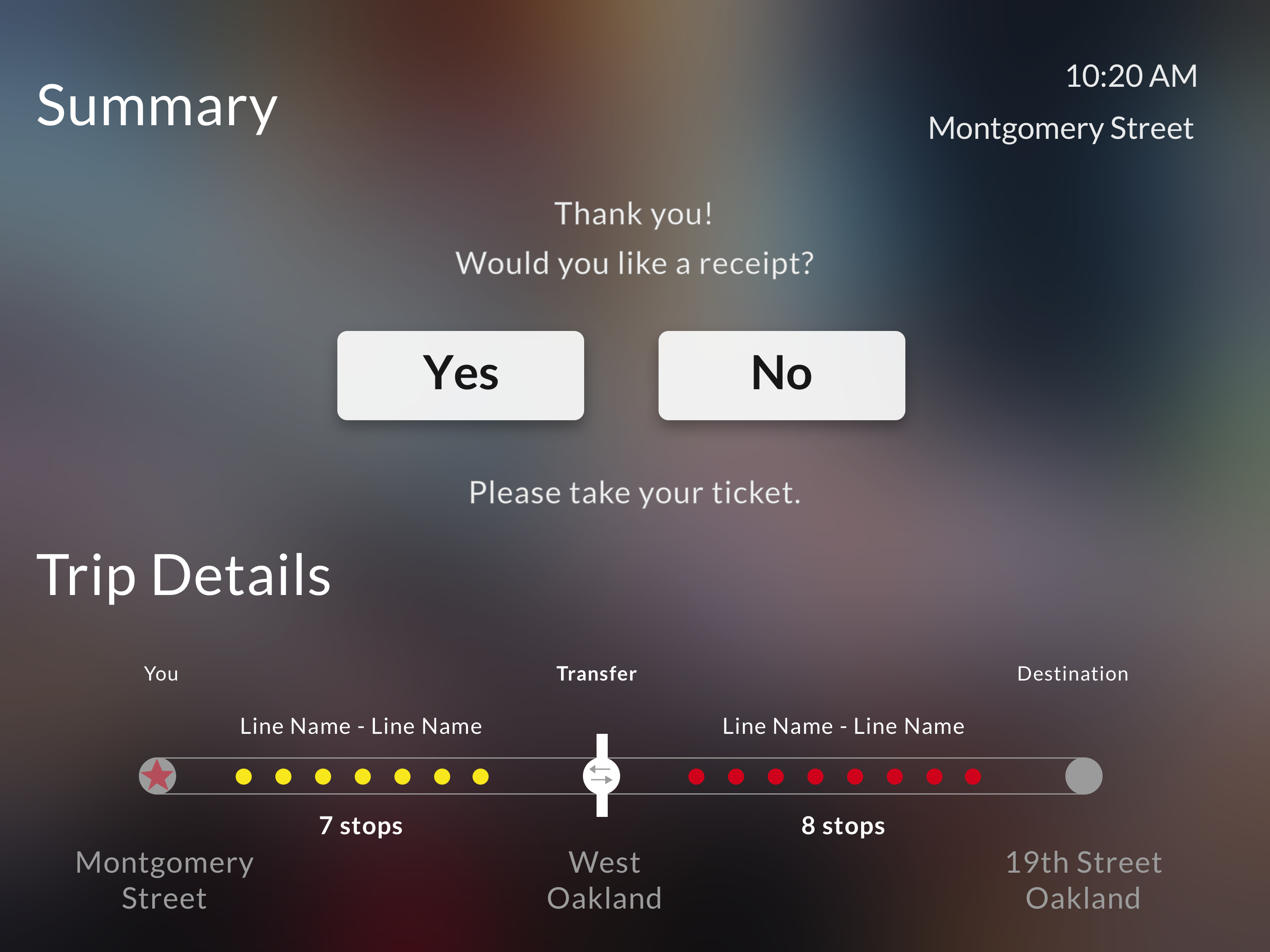
Once someone has selected their end station, it shows them the ticket price. Since our target customers are infrequent riders, it is important to give them direction to what line they will need to take. This will only show up for someone who selects “by destination” to helps them find their route a bit easier.

Adding a language is an international norm. Being such a diverse and international city, it was important we felt for the Bart to include alternative language options.
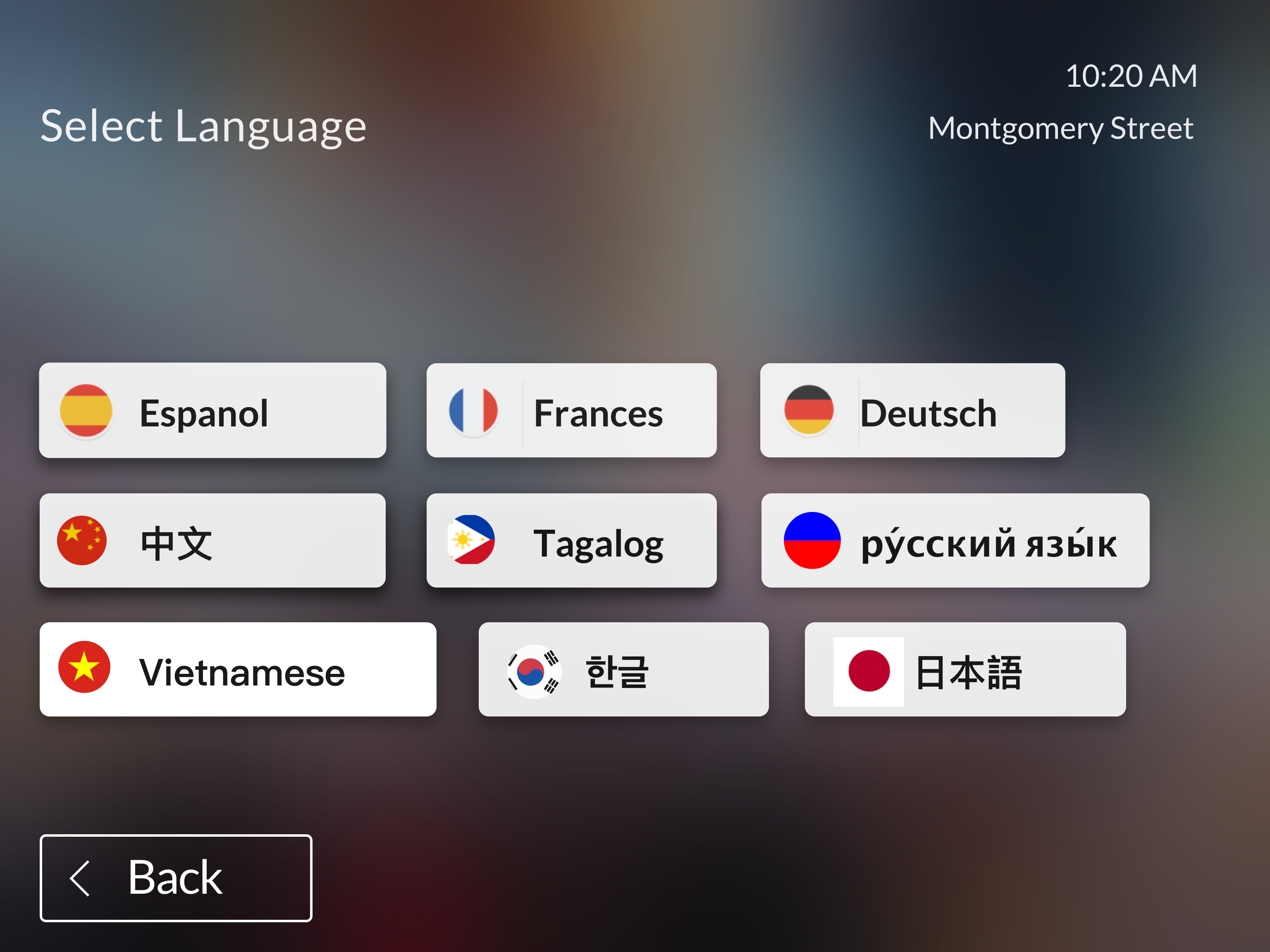
We looked up the top 8 languages spoken in the Bay Area.

New riders felt confused or frustrated by the way to add money with the current system. I wanted to give them an option to get through the flow quickly by selecting an amount.
%20.png)
In the current system, you need to manually add dollars or cents by pressing a button. We wanted a faster way for people to select the exact amount to make it more seamless.
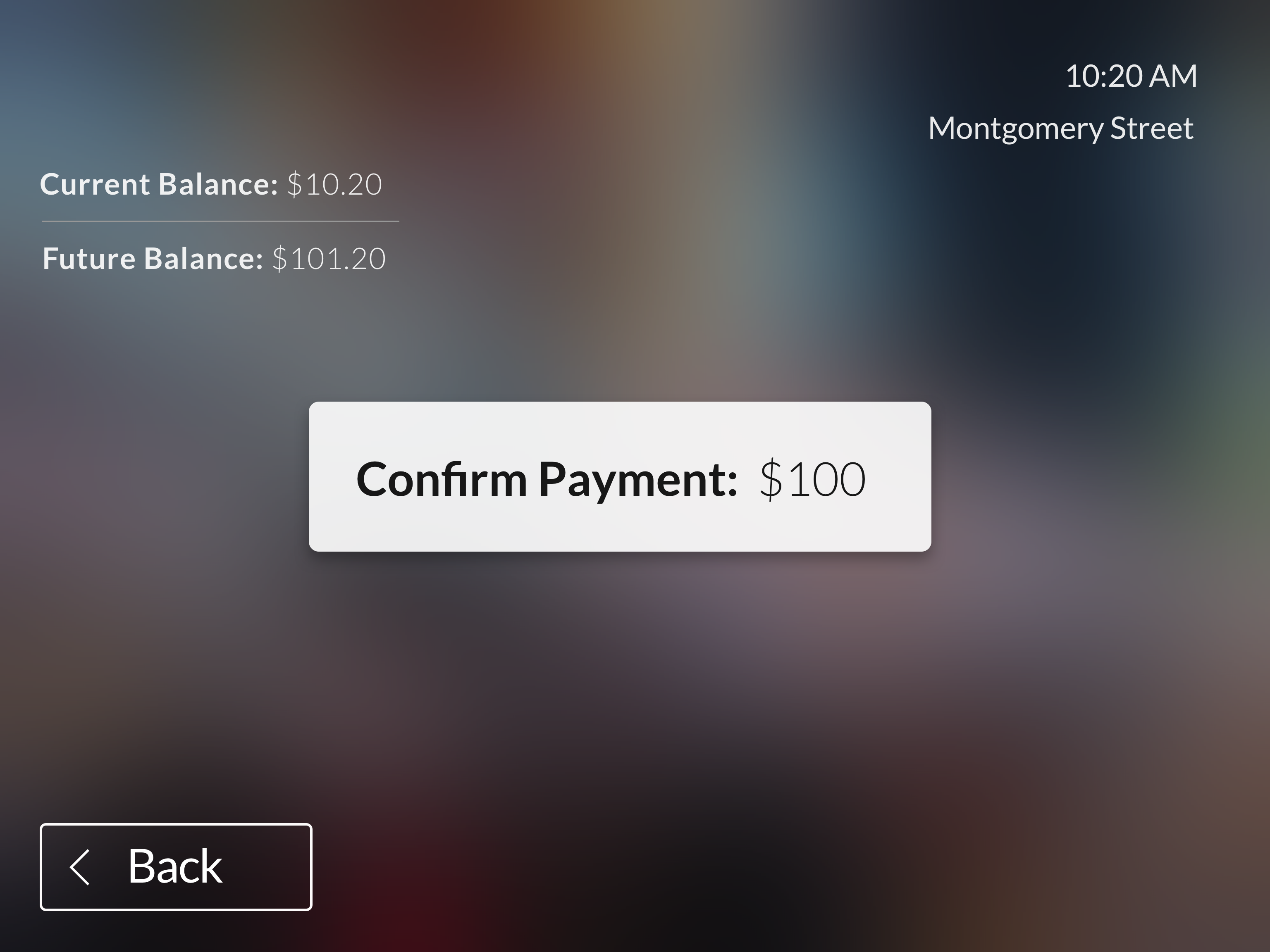
Users expressed feeling anxious about adding their payment first. To avoid that stress, we create a clear confirmation before adding their payment method.
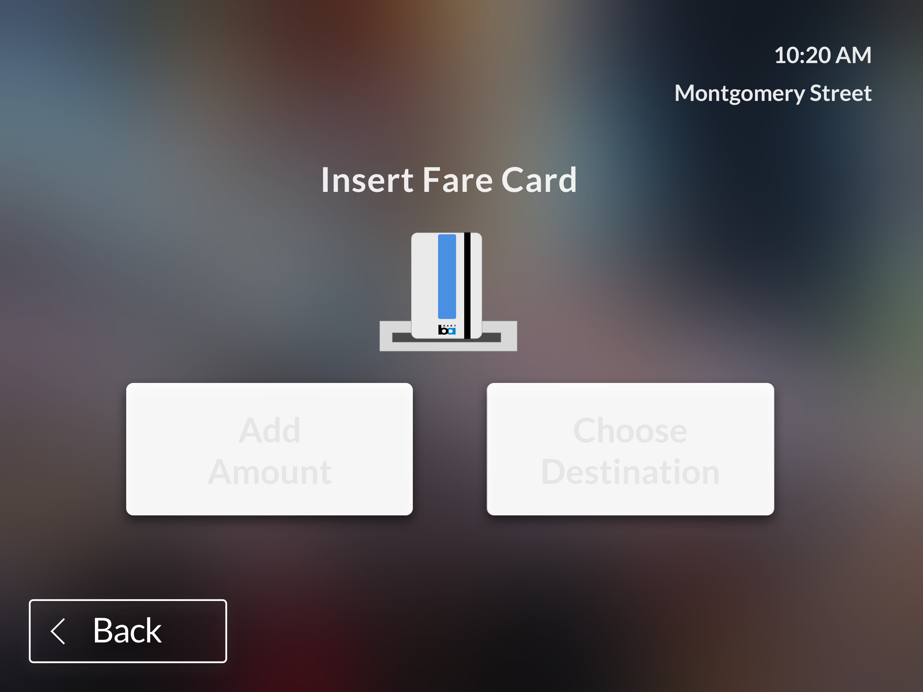
New riders have a hard time actually navigating the screens themselves. The machines should automatically go forward if people insert their card as they function now. However, if they haven’t added their card it will prompt them and show them how to.

Similarly, 4 of 10 riders experienced confusion or anxiety around paying and knowing when to add their payment method. We felt a picture with simple directions given to the rider at the appropriate time would alleviate some of that stress.
We tested at the same Bart station (the Coliseum - Oakland airport stop) and convinced 5 riders to test the prototype before or after they got onto the AirTran:

We assume implementing design changes to the ticketing interface for a mass transit as big and complex as Bart will not be simple. However, we wanted to see if our research could be helpful to their research and any future updates they will implementing. We met with someone at SPUR to understand the realities of updating the software for the Bart System. While the woman we spoke with was very informative, she pointed us to a company that services the machines, Cubic.
